Sea Ice Graphs
| Sea Ice Graphs16-07-2008 09:51 | |
| Frank Lansner★★★★★ (5727) |
I was asked to write in English on this subject, so i hope its ok with you Danes :-), obviously you can answer in Danish Discussion: Why is there difference difference between NSIDC artic ice extend curves and differences seen directly on the satellite photos from Cryosphere? Fig 1: Difference, 2008 arctic ice area – 2007 arctic ice area. The difference measured directly on the pictures from Cryosphere made a VERY FINE match with curves shown in Cryosphere and NSIDC and AMSR-E. Well, that is until around 1/6 2008. Hereafter, the changes seen on satellite pho-tos where not reflected so well on the curves. Fig 2: Here the NSIDC deviation from satellite photos. Something happends quite suddently around 1/6. We see deviations from picture to NSIDC graphs up to 1 mio kvm2. Reading "flat" ice extend from photo of a round globe obviously includes deviations. That is, a differ-ence near the edge of the globe does not count as much as a difference in the polar sea when looking at a flat picture. However, this effect is quite small especially in summer photographs where the melt-ings/differences are nearer the north pole. Here, the deviation is near zero. And all comparisons done in this writing, are made on the exact same date between 2 years meaning that the latitude of melting are mostly the same and thus comparable. So, any deviations should be smallest in the summer photos (nearer north pole) but we see the devia-tions only in summer.. all the rest have matched fine with official data. SO! The "round-globe" deviation cannot really explain what we see. Then what can? The arctic ice extend curves from Cryosphere and NSIDC, are they automatic generated? Or could they be subject to human corrections? I have never thought that these curves where under human influence, but was I wrong? : Here an example correction of how ice-anomaly, northern hemisphere was changed severely by Cryosphere: http://img401.imageshack.us/img401/2918/anomalykm3.gif This example of Cryosphere changing ice anomaly occured jan 2007. And here an example of corrections of NSIDC-curve, heres how it looked 20/4 2008: 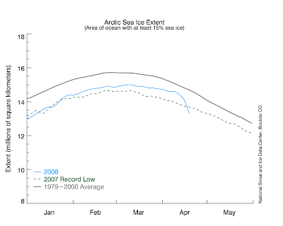 Then 21/4 the big fall in ice extent in april (not seen from other sources) was removed, that is data for 12 days where suddently changed:  The big fall was later introduced and removed again, but today its gone. But! If you check out fig 1 and 2 around first half of april, you will see that the satellite photos actually dives there (!) and its now the only place before 1/6 where there is a mismatch. So possibly the NSIDC where correct with the fall in april? Anyway, i now know that the the ice extend curves appears to be subjects to corrections like GISS / Hadcrut tempgraphs. Fig 3: When creating a way to retrieve iceextend from the cryosphere photos, I could not resist making a comparisation of all 15 July´s since 1979 of arctic ice extend. The most interesting reading from this graph may be, that 2008 15/7 is just approx 0,45 mio kvm2 from the average of iceextend of the whole period 1979 – 2008. Not an extraordinary melting this year. And, in addition the Candadian wheather forecast predicts temperature below zero degrees around the north pole the rest of July... The ice-anomaly for the arctic on CRYOSPHERE, it says - 1,2 mio kvm2 and not the approx - 0,45 mio kvm2 derrived from raw photos. If the ice extend today was actually 1,2 mio kvm2 bigger, then we would have record ice extend in the arctic. We would have an ice extend that just accurately is bigger than previously seen since 1979. Update: The 1,2 mio kvm2 was from 8/7, not 15/7. Test it yourself: 1,2 mio kvm2 is approx 56% the size of Greenland (= 2,15 mio kvm2). Try to fit in an area of 1,2 mio kvm2 extra ice here (to the right): http://igloo.atmos.uiuc.edu/cgi-bin/test/print.sh?fm=07&fd=15&fy=2007&sm=07&sd=15&sy=2008 - i have tried to fit in the 1,2 mio extra ice on the satellite photo for 15/7 2008, and it seems that no years at all has quite such a big ice extend 15/7. Tilknyttet billede: 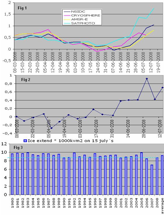
Redigeret d. 16-07-2008 12:02 |
| 19-07-2008 19:00 | |
kulden-varmen ★★★★★ ★★★★★(2597) |
Frank Lansner skrev: The sea ice is a immeasurable variable. The ice grow and melt constant. The ice grow and melt in directions. It have many directions., underside, top side, and a long edge and inner sides by pocket of water. It is not possibly to measure that, in a serious way. However the discuss is pointless, because the heat go from tropical regions to polar regions. The ice only cool the weather local, but the ice insulate the sea from the polar winter, as the sea melt the underside, of that cause the ice never been more that 6meters thick in large area. The ice have no influence on the Gulf Stream because it been controlled of the wind and the polar night. |
| 19-07-2008 19:51 | |
| Kosmos★★★★★ (5371) |
I have never thought that these curves where under human influence, but was I wrong? - no idea; but here is some supplementary, current info on polar ice coverage. |
| 22-07-2008 15:54 | |
| Frank Lansner★★★★★ (5727) |
The correctionfactor used by cryosphere from Jan 2007 and forward. http://img401.imageshack.us/img401/2918/anomalykm3.gif From satellite photos I concluded that the anomaly of 15/7 2008 was approx - 0,45 mio kvm2. basis was 1979-2008. With basis 1979 - 2000 we get instead - 0,55 mio kvm2. Cryosphere said approx - 1,2 mio kvm2. And?? Well look at the picture below. Here we can see that the Cryosphere correction done January 2007 means an enlargement of the negative arctic ice anomaly of no less than 0,65 mio kvm2. Tehe... get it? Without the huge cryosphere correction, the anomaly from Cryosphere today would have been exactly - 0,55 mio kvm2 as derrived from satellite photos And more, can you see anything strange about the cryosphere correction on the picture below? Normaly if you discover an error in the equipment, the measurement method etc. you would expect approximately THE SAME CHANGE ON ALL YEARS! But no! This cryosphere corrections comes graduately, it gets bigger for each year!! So how on earth will anyone explain this? "The previous results where more and more wrong for each year.... " No, this looks like a classic IPCC correction-factor that - as all others - just happends to support the message of IPCC..... Tilknyttet billede: 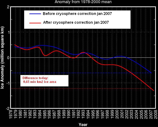
Redigeret d. 22-07-2008 16:12 |
| RE: Here are some additional graphs from NSIDC ...22-07-2008 16:20 | |
| gorm★☆☆☆☆ (81) |
... National Snow and Ice Data Center (NSIDC) : http://nsidc.org/news/ http://nsidc.org/data/seaice_index/images/daily_images/N_daily_extent_hires.png  http://nsidc.org/data/seaice_index/images/daily_images/N_timeseries.png  |
| RE: Sea Ice Graphs, tr05-02, DMI01-04-2013 16:38 | |
| pofranck☆☆☆☆☆ (3) |
Frank I was re-reading your article in WUWT May 2, 2012, love the charts and logic. In the comments Mick J mentioned a DMI reeport http://www.dmi.dk/dmi/sr05-02.pdf I was surprised to find that view point from DMI. The 'low frequency oscillation' that dominated the ice export through the Fram Strait as well as the Above link is still active, however if you go to DMI.dk and search for the report you get following: http://www.dmi.dk/dmi/index/klima/fk-introduktion/publikationer_dkc/publikationer_dkc_old.htm Rapport 05-02 So I was going to ask DMI why and when it was cancelled. However their communication is down, supposed to be up today 15:00, but still down. Just wondering if you have any information on it? Redigeret d. 01-04-2013 16:40 |
Deltag aktivt i debatten Sea Ice Graphs:
Lignende indhold
| Debatter | Svar | Seneste indlæg |
| The ice is melting at the poles...pole...p | 5 | 25-11-2015 20:46 |
| Southern Ocean: Udviklingen i Sea Surface Temperature og Sea Ice Cover. Analyse af data fra NOAA. | 40 | 16-09-2015 14:50 |
| Southern Ocean: Sea Surface Temperature and Sea Ice Area - links II | 2 | 01-12-2014 12:50 |
| Southern Hemisphere:Udviklingen i Sea Ice Area og Sea Ice Extent.. | 0 | 11-08-2014 11:48 |
| Foredrag 15/2 - Observing climate with Satellites - Are We on Thinner Ice? | 3 | 11-02-2011 13:49 |